Of course, you could write the report out in so many words,
just as it was given in the paragraph above. But it would be
much easier, much clearer, to tabulate the figures and present
them to the factory in the manner shown in Table No. 6. Notice
how clearly the comparison between the sales and the years
stands out. The manufacturer receiving these facts in this form
will instantly get a very vivid picture of your business and its
growth.
Here there are two sets of values compared--years and sets
per week. These values apply only to your particular business
--you have not worked out a table in the true sense of the word,
but you have set down the facts known to you in tabular form.
Your statement shows very clearly the relations existing
between sets per week and years. These relations change with
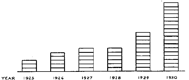
Fig. 7
the years--thus, your facts show a changing relationship. A
table, such as any of our tables of measurement, show a constant
relationship--a foot is a/7ualls 12 inches, a yard is always
3 feet, and so on.
GRAPHS
Now when the factory receives your table of comparative
values--the average number of sets sold per week shown in their
relationship to the different years--they will most likely be very
much interested and impressed. They may want to send copies
of your record to their other dealers to encourage them and
show them what they, too, could be doing.
But they will say to themselves "Let's make these facts
still clearer--let's make them stand out so vividly that they will
actually 'jump out at' our dealers. So they get someone to
make a drawing showing your comparative values. He may do
it as shown in Fig. 7. On a horizontal line with divisions
to represent the individual years, he draws piles of blocks representing